
User Tools
 This version (2013/12/23 08:59) is a draft.
Approvals: 0/1
This is an old revision of the document!
Table of Contents
Oxwall Interface Design
All about developing user interfaces for Oxwall.
According to Oxwall design principles, user interfaces are implemented in plugins (not themes). These instructions in document serve more for plugin developers than for theme designers. We make it possible for you to build your functionality consistent with established Oxwall interface paradigms. This will be a result of integrated user experience which is our ultimate goal.
Boxes

Box cap

Usually contains the title of widget and its icon.
Box menu

Usually used for various selections and/or modes of content display.
Box toolbar

Usually used for summary info and/or further actions with content.
Buttons
Standard button

Used for main form actions, standalone actions and is prominently displayed with unambiguous captions. A big size of standart buttons is inherent.
Button list

Used for group actions upon objects. Color coding may be applied for highlighting the meaning of an action. A modest size for button list is essential.
Label button

If it's used as a button, appears with mouse over effect. It can be used in profile view, forum and around the avatar area; characteristically has a small size.
Context Action
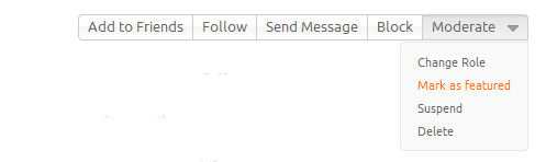
A button or a block of buttons with optional dropdown menu. Usually more important content is in a block of buttons and less important is placed in the dropdown menu. It is often placed in the top right corner of a container. In case your plugin logic requires it, you can change the position. Use the dropdown menu with mouse over effect. Context action as a design element.
Forms
Form submit

Oxwall contains a number of forms. The forms vary from complicated ones to containing several buttons. There are two types of form submit: positive (including neutral) and negative.
Positive submit: Positive actions consist of form actions: Submit, Save, Register, Create, Add etc. Additional positive actions can be used as an alternative for a main action. For example, creating a blog post you can let user choose either to Publish or to Save as draft. When there are both main and alternative action are together, it's recommended to highlight the predominating action by a CSS class, to indicate which is obviously the main.
Negative submit: Negative actions consist of form submits: Cancel, Reset, Delete etc. Negative actions ought to be placed on the right corner and highlighted with special CSS class in order to prevent user from pressing it unintentionally, but some exceptions are possible as well.
Note: We use standard buttons for regular forms.
Example
In order, to develop a form for creating the blog post. We would need a Publish button, placed on the left side, below the form:

We have to give users an option to save it for future as well; let them edit the content later, till the time they desire to publish it. An alternative action is to Save as draft. The presence of the alternative action, requires the choosing of a main action. So we apply a special “positive” CSS style for the main action, which in this case would be Publish. In this theme we highlighted the button label with orange color:

As about editing the post, we let users cancel their ongoing changes. We've added Cancel button. Since it's been considered as a “negative” action, we located it on the right side of the form to prevent user from undesirable actions, like if they would click it accidentally. In this theme we highlighted it with a special “negative” CSS style. Also Cancel button has no icon:

There's an option for the user to remove the post completely even if the post is still in editing condition. For that we put a negative button, which is Delete post:

Popup confirmation

A floatbox with a confirmation text and a button offering a referential action. The Cancel button is absent, to prevent the undesired accidental clicking. We've put an X-close for canceling the action option. (Esc button cancels it as well)
Sort control

The buttons to sort the content by several options. The first option is always default. The options label names have to be as short as possible and contain preferably less than 4-5 options to avoid the blocks of buttons grow out of the space.
Page Tools
